Of all the companies that printed Christmas cards in Victorian times, the most consistently strange (to my mind) come from the De La Rue Company. Some will give that distinction to Raphael Tuck & Sons, with good reason. The Tuck company would basically slap “Compliments of the Season” or “Merry Christmas” on any image they could get their hands on. [Next post will be about them.] That led to some awesome incongruities. But Tuck was more about quantity than quality, and their production was pretty random.
De La Rue, though…these guys had an eye for the odd. The firm itself is still around and has been in and out of printing throughout the decades. They only had a ten year run of printing holiday postcards, but their output during that time was outstanding (1875 to 1885).**
During that short time, they hired artists who had a range of different approaches that hadn’t been seen much in the already over-saturated Christmas card market. (They were also one of the few firms that went looking for female artists, hoping to expand their market by appealing to specific demographics.)

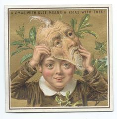
The one thing they get mentioned for most is starting a new trend of cards with naked or semi-naked children. Now, while that’s not what I find, um, attractive, it certainly got them notoriety. Cards with little kids were hugely popular, likely capitalizing on the Victorian love of all things sentimental, and showing a sweet little girl all decked out in her Christmas finery was a sure way to sell a card. But De La Rue hired a number of (actually mostly female) artists who, for reasons I’m not entirely sure of, decided to ditch the clothes and present these kids in semi-pastoral or almost pre-Raphaelite settings.

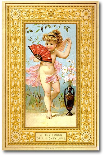
I don’t enjoy thinking about why they sold so well. (There’s a whole Pinterest board of them here…not really my thing, which is why I’ve never shared any of them before. W.S. Coleman and Rebecca Coleman were the two artists responsible for most of them.)
But De La Rue also gave their artists pretty free reign to design whatever they wanted.
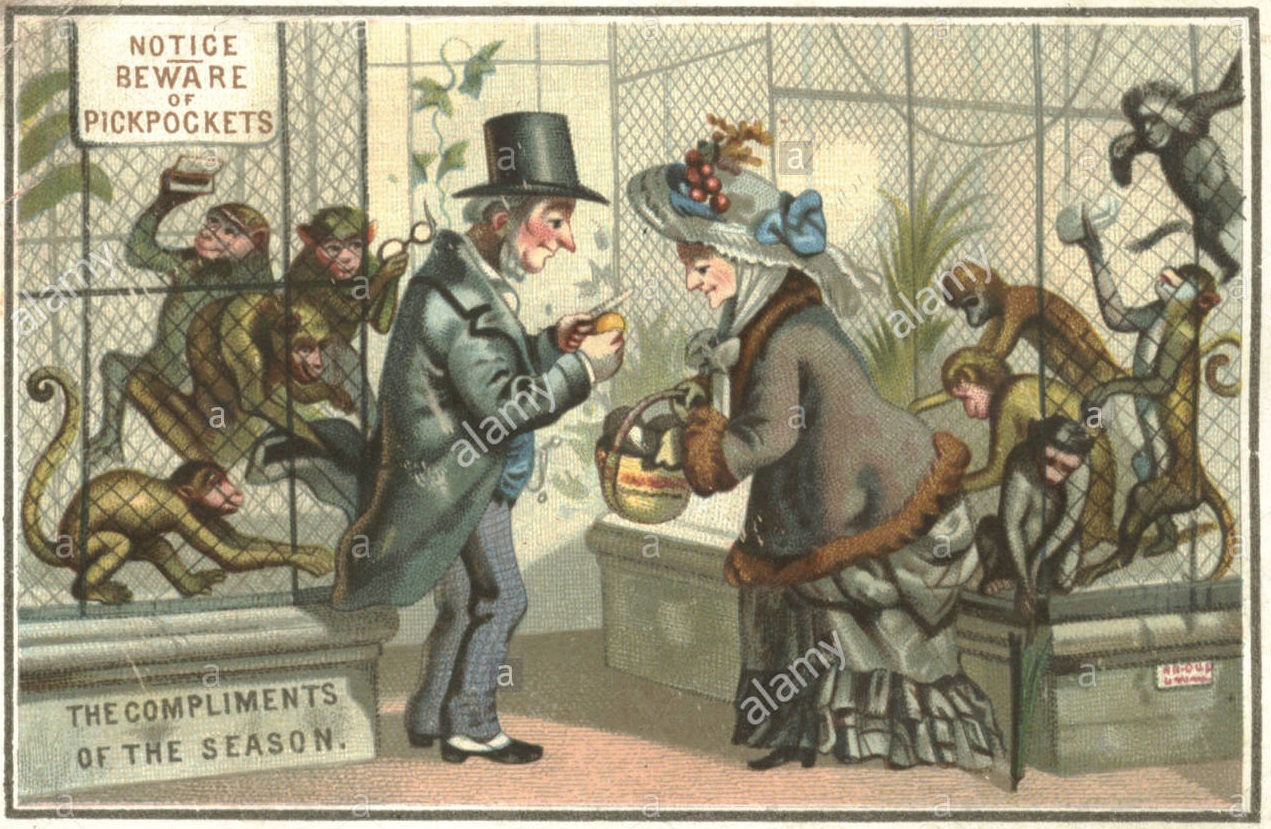
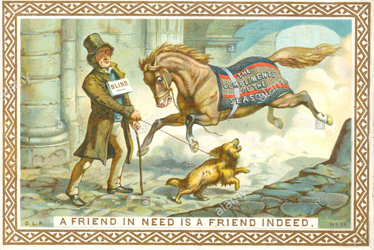
Some went for the straight humorous.
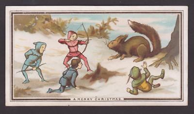
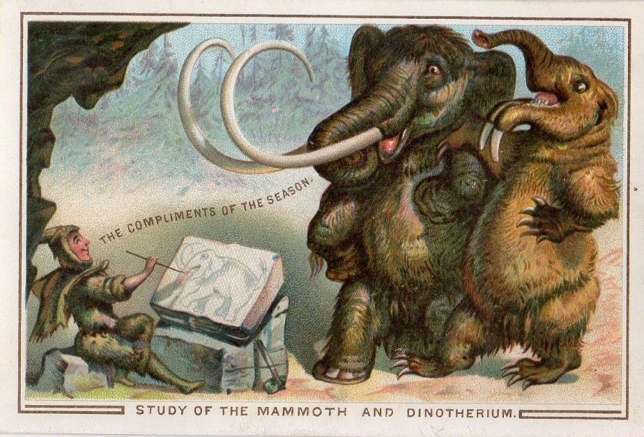
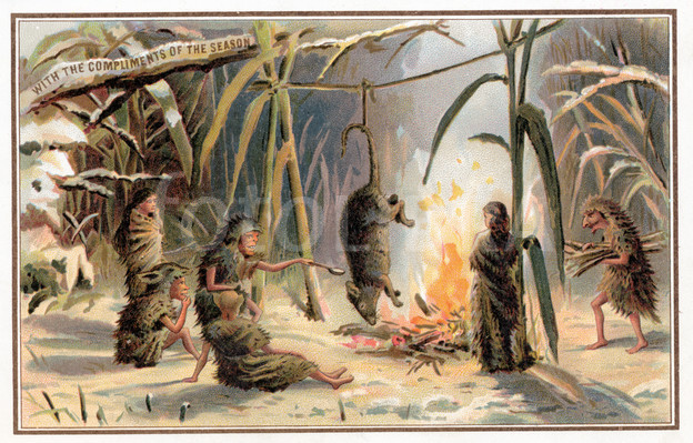
Others took an approach that took advantage of the Victorian interest in natural history. (Thanks, Darwin!)

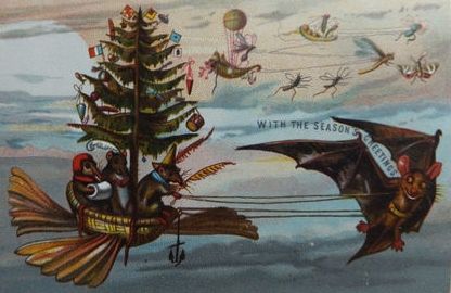
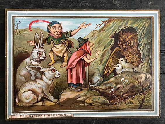
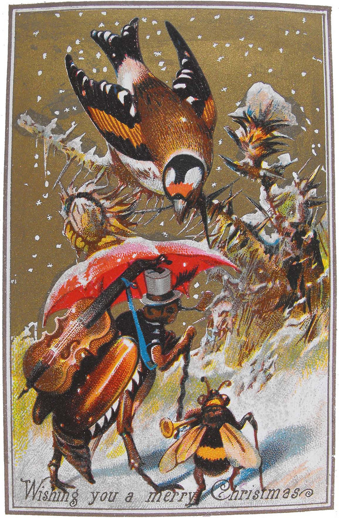
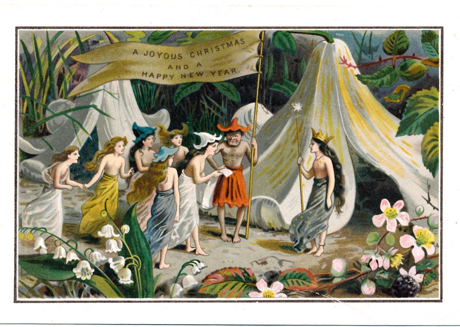
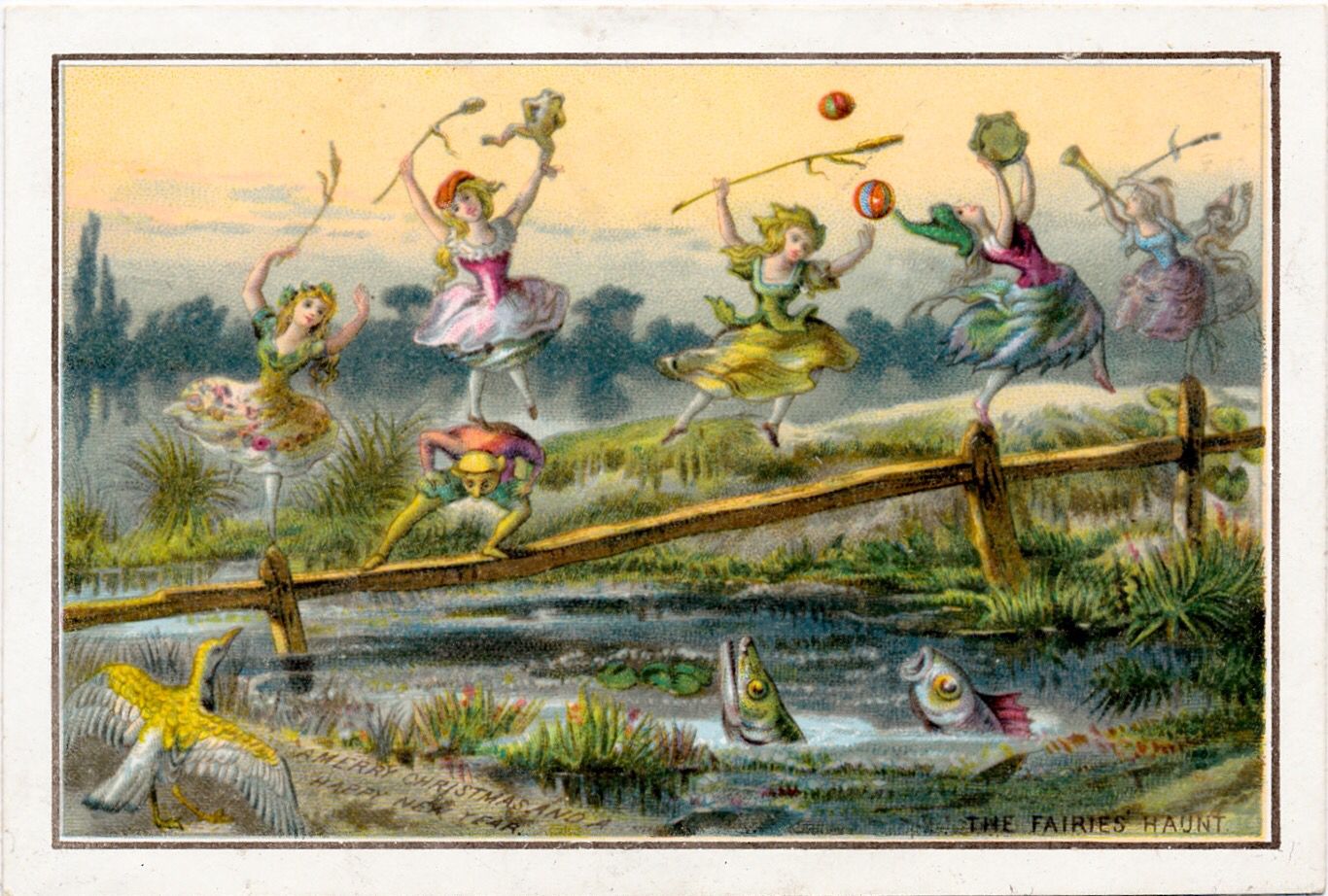
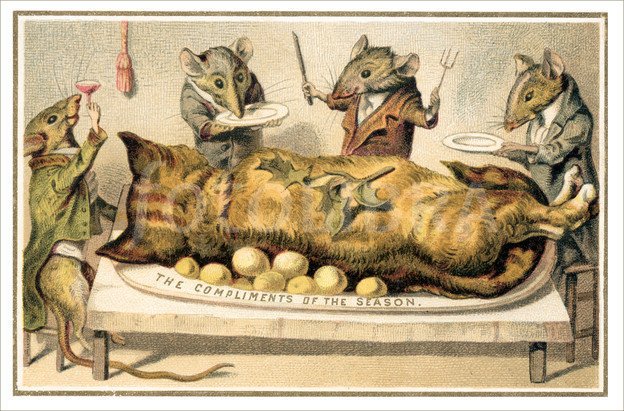
Still others went full on fantastical, with series including all kinds of fairy images, anthropomorphized insects, and, maybe my favorite, a series of tiny rat-hunters.
All of this begs the question, though: what did any of this have to do with Christmas? Honestly, probably nothing, except that Victorians really, really wanted to buy as much crap as they possibly could at Christmas time, especially as the century wore on.
Plus, the cards were a source of visual novelty. People kept them, framed them, collected them, and traded them. You couldn’t scroll through Instagram, so this was an excuse to spread some art and share some fun.

And De La Rue could do that in spades. To us, seeing “Merry Christmas” on a card showing a blind man about to get run over by a horse doesn’t fit the appropriate sentiment of the season.
But De La Rue knew their audience wanted something fun and novel, so they responded in some truly idiosyncratic ways. And they also went all in on the detail of the illustrations. A lot of cards show very generic images, and I sometimes think I’ve seen the exact same “snowy backgrounds” and “cozy hearths” repeated in a bunch of the cards. But De La Rue let their artists create each image with as much care and thought as they wanted.
In the end, what makes De La Rue special to me as opposed to Tuck & Sons was their intentionality. They knew for a fact that they were printing odd Christmas images, and they committed to it. A lot of other companies just tried to stick a Chrismtas tag on anything to see if it would sell. They might just get hold of some stock images they could print and add a Christmas border around it. But De La Rue were trying for the weird. And they achieved it. I have to tip my hat.
** (Buday, 67). If you’re interested in the history of Christmas cards, there’s one and only one place to start: George Buday’s The History of the Christmas Card (London: Salisbury Square, 1954). There are plenty of other collections and studies out there, but Buday set the standard.
… and if you enjoy my site, consider buying me a coffee. It helps support the contest, podcast, and to get all the cards ultimately uploaded and searchable.


2 comments